Guest post by: Sanket Jain
I recently subscribed to Aldo, Canada newsletter. They sent me a prompt welcome email requesting for a confirmed opt in and followed it up with a 10% off coupon (nice!). After that I have been receiving two newsletters from them every week. I love Aldo’s shoes, bags and belts; but their email marketing could get a little boost.
I pay a lot of attention to the newsletters that I receive everyday and try to explore by clicking, engaging and look for any aspect of personalization or dynamic content.

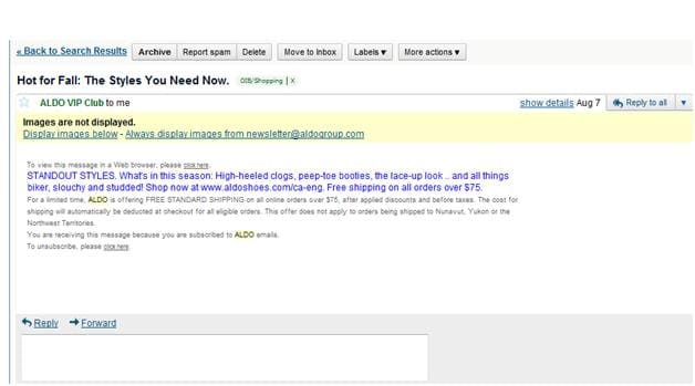
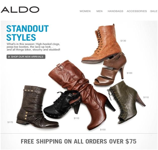
While I was exploring newsletters that I had received from Aldo over the last two weeks, I must admit my user experience was not exactly smooth sailing… As a Gmail user, images were not enabled for me by default and the text version of the email did little to convey the Aldo brand and message. Alt text was not used for the important headlines, images, offers and calls to action. Regardless of the text formats visible appearance, I decided to explore further and I turned on the images.

Immediately I noticed that I was not able to click on any of the links within the newsletter. So even if I was interested in a product, I couldn’t click and proceed to buy. When I checked the HTML I noticed that they were using image maps which do not go very well with Gmail – Yahoo and Hotmail also block image maps.
Once I finished my analysis of the newsletters, several thoughts crossed my mind. There are quite a lot of best practices that should ideally be followed by all permission based email marketers. These are the practices which ensure that the marketer gets lots of opens, clicks and most importantly a good return on the marketing dollar.
Here are some of the best practices which came to my mind after my analysis of the Aldo newsletter:
- Double check your Authentication: You should be sure that all the outbound email servers from which mails are being sent are mentioned in the sending domain’s SPF and Sender ID records.
- Creative teams should be advised to stay away from image maps. They do not go well with Gmail, Yahoo and Hotmail. Inability to click on images may leave the recipients dissatisfied and leads to a depleted user experience. Additionally, most ESP’s do not measure clickthrough on image maps.
- Alt texts should be used for important images, calls to action, offers and headlines.
- Without the images, the newsletter should not look cluttered and readers must be drawn to the offers. The best offers should be included in the body text, defined image sizes (width and height) and be supported by alt tags.
- Recipients should be given an easy way to update their personal information or email preferences. Some users may end up unsubscribing because they could not find an easy way to update their personal information.
- Provide an easy unsubscribe mechanism (preferably one touch), the landing page should have the affirmative option prechecked.
- Sender’s postal address should be mentioned in the footer of the email. This is a legal requirement under CANSPAM for marketers sending email from or to US and once FISA comes into effect, it will also become a legal requirement for Canadian senders.
- Have a link to the privacy policy in the footer of the email. This is helpful in reassuring recipients that the company is concerned about the way it collects, stores and uses personal information.
- Explore the idea of using customer’s purchase behavior for dynamic rendering of emails.
- A small map to the nearest store (request for zip code during sign up) could be provided below the fold. In this way, traffic is driven both to the website and to the store. May be having a map v-s having a ‘store locator’ link could be tested.
- Recipients could be encouraged to take a print out of the newsletter (which has a barcode). This way specific email campaigns can be measured (both online and offline sales) for return on marketing dollars.
About the author:
Sanket Jain is a recent marketing graduate, working with Emailkarma.net founder Matt Vernhout. Contact him via twitter: @sanketjn


well done analysis