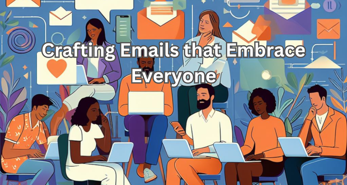
A well-crafted layout, a splash of color, a witty subject line – all conspire to snag attention and spark conversions. But in the rush to dazzle, a crucial element often gets sidelined: accessibility. With an aging population in North America every day more people rely on vision assistance to continue with their day-to-day life.
It’s important to remember that not everyone experiences the world the same way. Some navigate with screen readers, some struggle with color blindness, and others prefer keyboard shortcuts to mouse clicks. Neglecting these diverse needs not only excludes potential customers but also undermines the very essence of effective communication. There may also be legal implications for failing to properly address these concerns.
So, how do we transform our email masterpieces into beacons of inclusivity? It’s not about sacrificing aesthetics or diluting our message; it’s about weaving accessibility into the very fabric of your email’s design. Here are a few things to consider when you’re updating your emails to be more accessible friendly:
Words Matter:
- Font Choice: Ditch the quirky script fonts and embrace high-contrast, sans-serif faces like Arial or Helvetica. They’re legible across devices and won’t leave anyone squinting at pixelated letters. Consider your font sizes as well, the Web Content Accessibility Guidelines (WCAG) suggest that fonts 12 to 16px in size be used for websites, and that is likely a good comparison for email as well.
- Color Harmony: Palette selection isn’t just about brand aesthetics; it’s about ensuring everyone sees your message clearly. Avoid stark contrasts and use tools like WebAIM’s Contrast Checker to guarantee vibrant, legible text.
- Alt Text: Every image deserves a descriptive alt text, a mini-story that paints a picture for screen readers. It’s not just about “pretty sunset” – think vibrant hues, playful children, or perhaps the aroma of freshly baked cookies.
Structure your content:
- Keyboard Navigation: Not everyone clicks; some navigate with the keyboard or other assistive devise. Ensure your email structure allows tabbing through elements like buttons and links, creating a friendly map for those who prefer the keyboard shortcut route.
- Headings: Headings aren’t just decorative; they are the guideposts on your email’s narrative. Use clear, concise headings that guide readers through your message, not cryptic titles that leave them wondering where they landed.
- Simplicity: Forget the nesting tables and intricate layouts. Embrace clean lines, ample white space, and a structure that’s easy to follow on any device, from desktops to smartphones.
I won’t dive into code emails for accessibility as it’s not my forte and I’d rather not embarrass myself here. However, there are some great links that can help guide you when it comes to accessibility in email from the team at emailht.ml.
Many countries have adopted accessibility laws or policies, often referencing WCAG as a standard for accessibility. Compliance with web accessibility laws and standards is important to ensure equal access for all users. You can find a comprehensive list on the W3C’s website: https://www.w3.org/WAI/policies/
By incorporating these principles, you not only create emails that dazzle the eyes but also resonate with every heart and mind in your audience. Imagine, your message, clear and vibrant, reaching everyone – tech-savvy millennials, visually impaired veterans, and keyboard-loving grandmas alike. That’s the true power of inclusive email design, and it’s a revolution worth embracing. So, step into your digital chef’s hat and whip up emails that are not just visually delightful, but universally accessible. After all, the most captivating messages are the ones everyone can hear loud and clear.


